Worlds without limits: the creation of enthralling environments

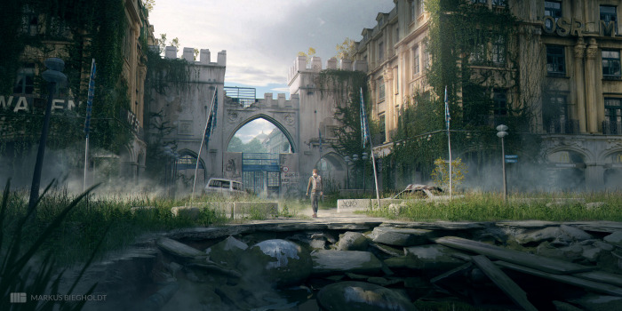
‘Concept art’ is a useful umbrella term, but it doesn’t capture how expansive a field it is. Within Atomhawk alone, we house so many specialisations that are classed as concept art. Our character and environment teams have multiple sub-disciplines in each, and our creatives have many directions to hone their artistic and technical skills in. Each discipline has real depths of expertise to master.

We follow an ‘artist first’ approach, which informs every piece of work we create. This means we make a direct connection between high quality creative output and artists who are empowered and supported in their day-to-day work, and their long-term career goals. This ethos is foundational to our way of working.

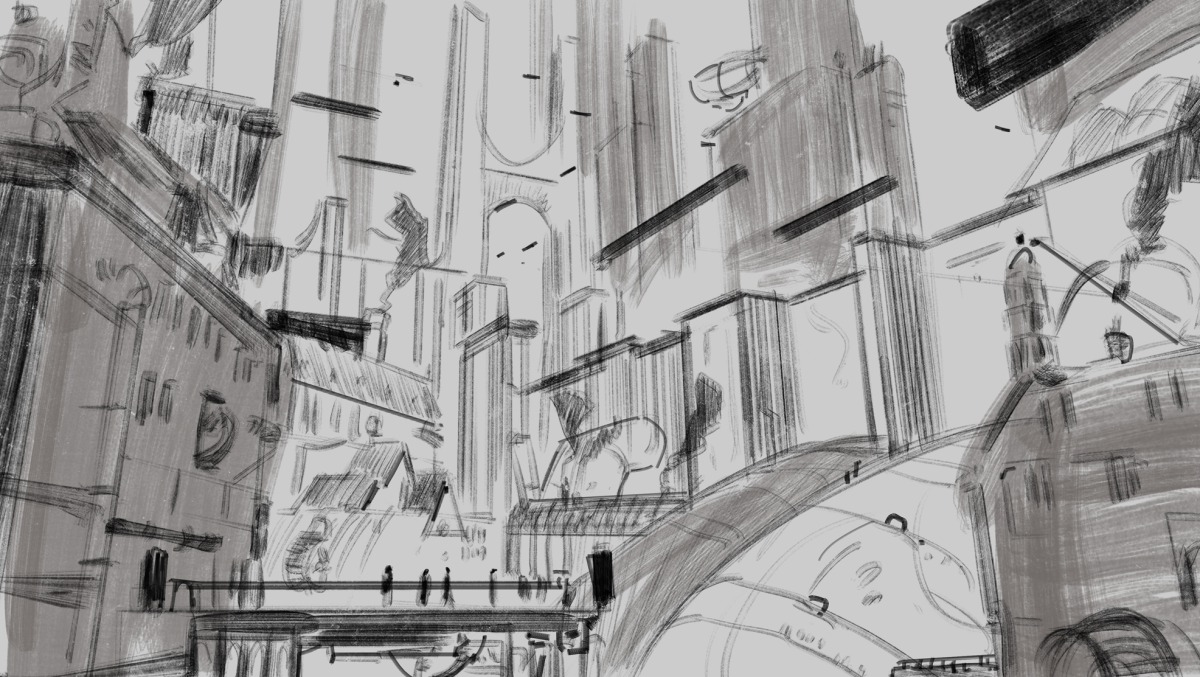
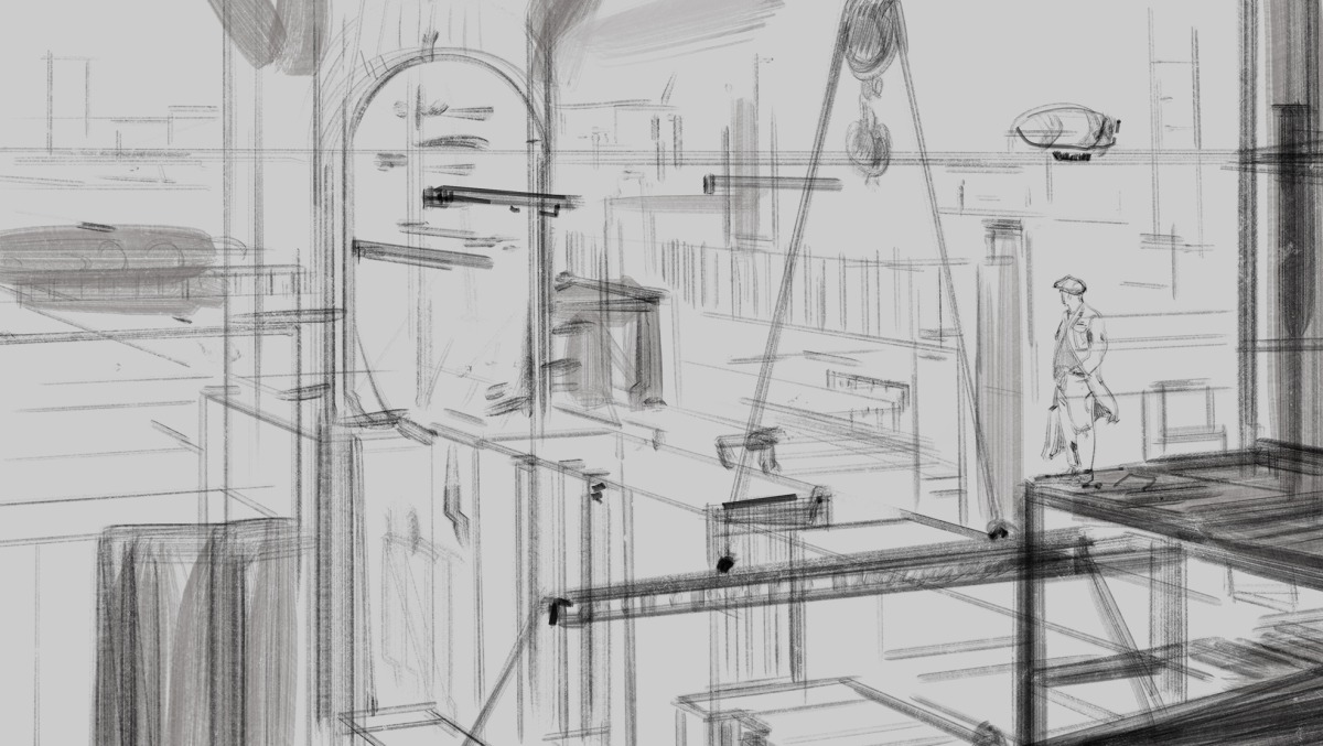
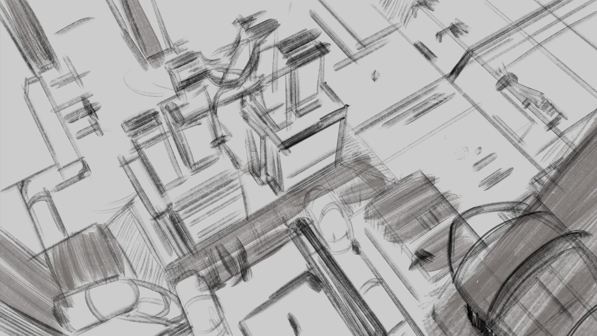
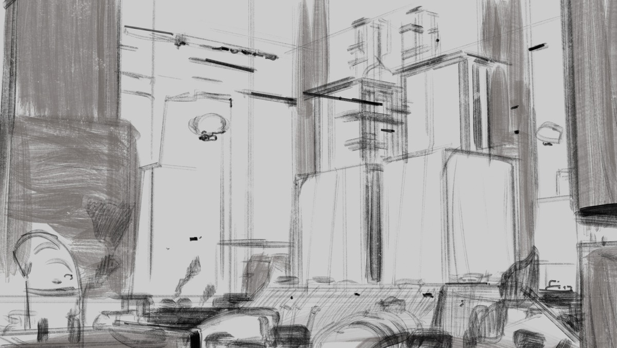
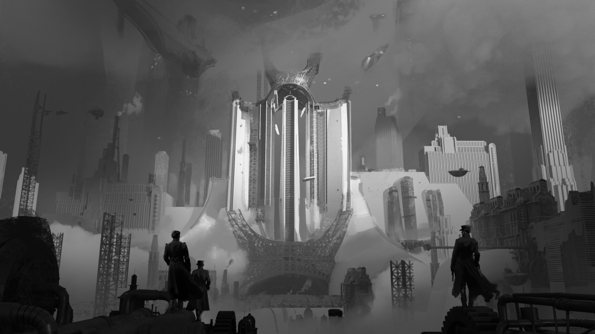
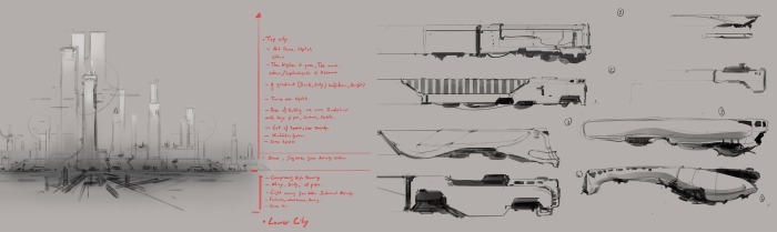
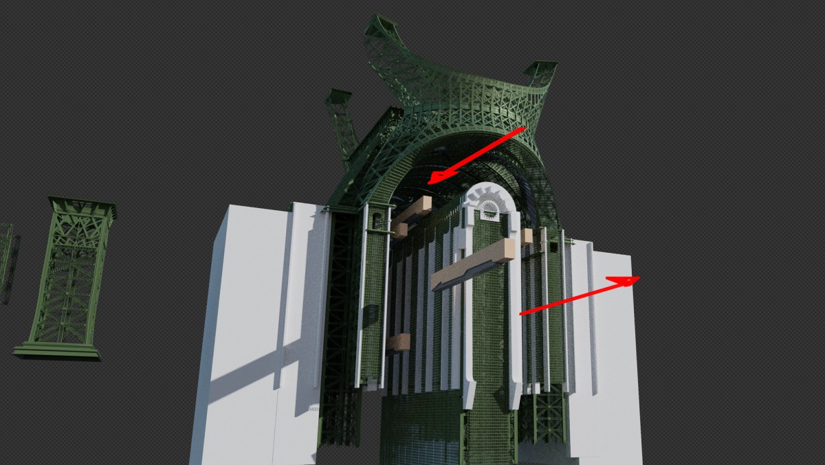
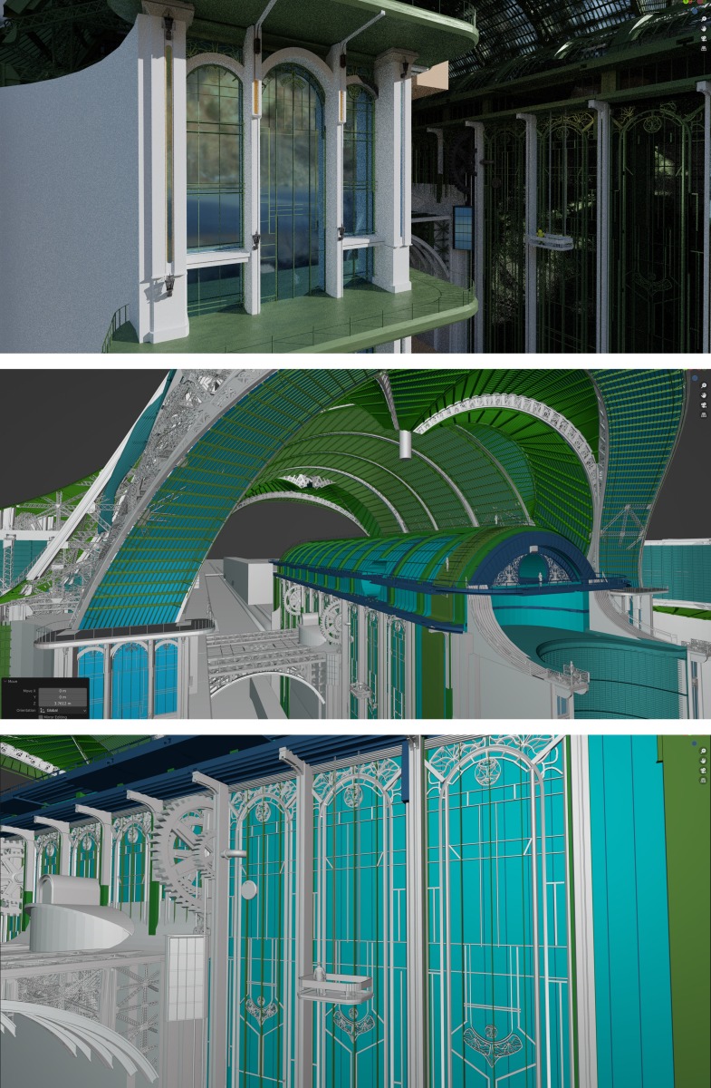
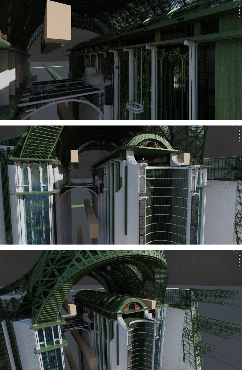
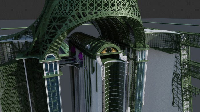
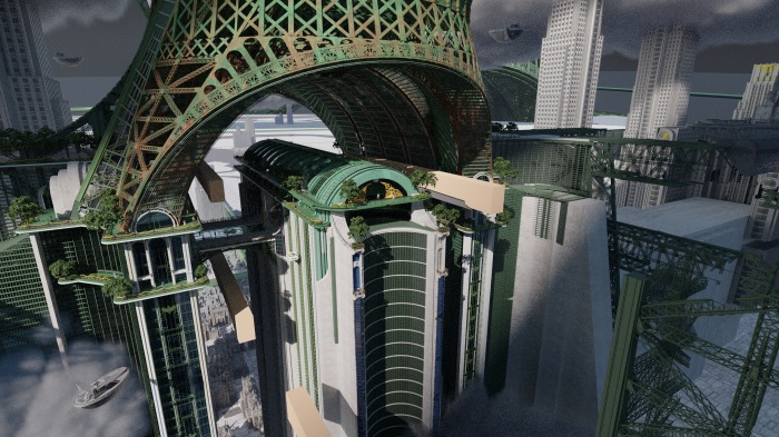
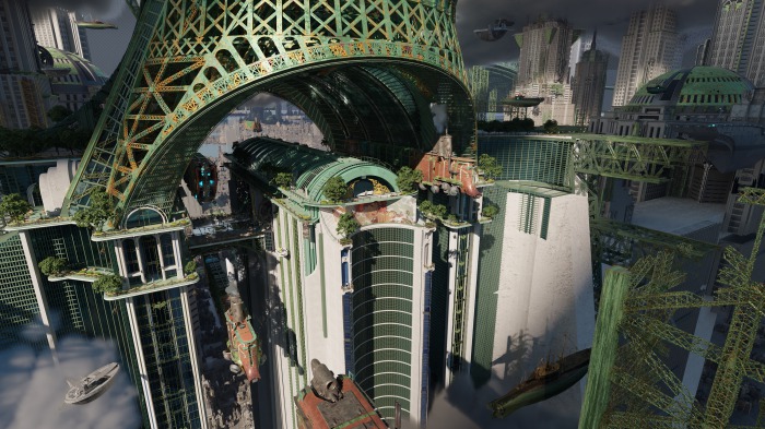
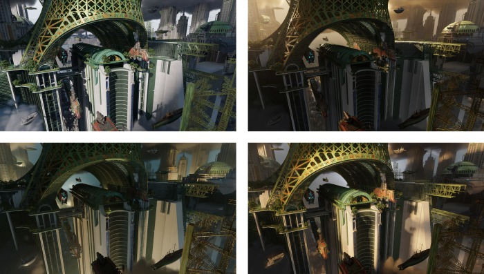
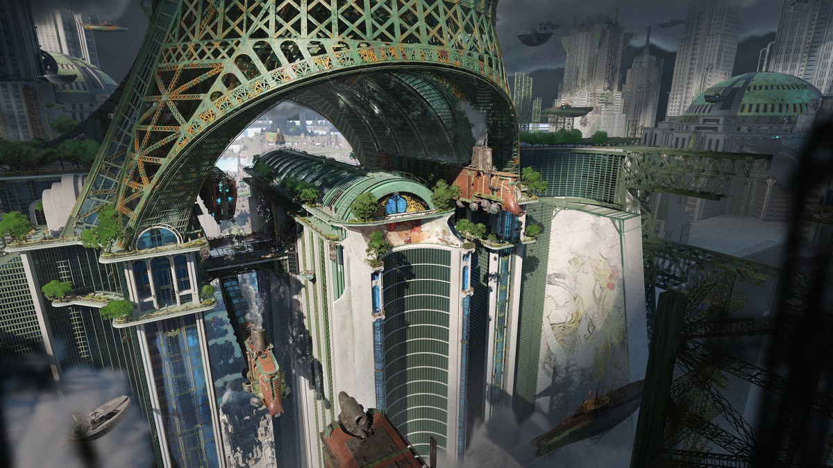
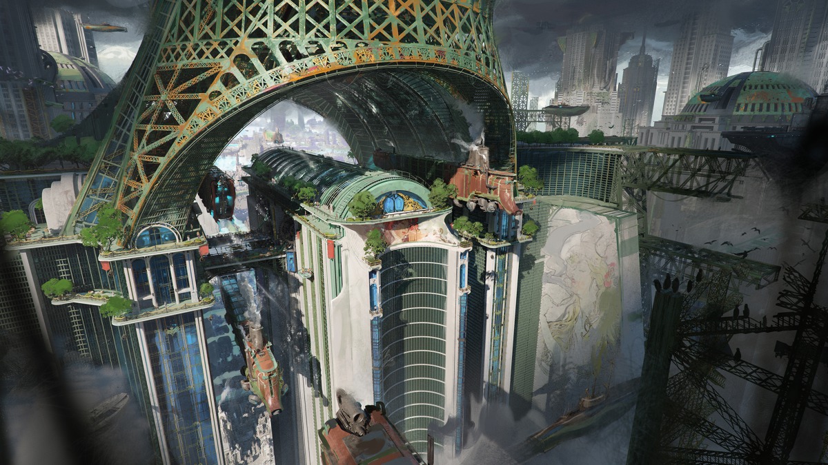
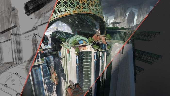
Today, we’re focusing on Environment Art, with Louis Laurent, Lead Environment Artist from Atomhawk Canada. He’s taken the time to lead us step-by-step through how he created this intricate and imposing steel edifice.

Moodboarding

“For the moodboard, I like to take references from the real world first. So, I’m starting with something that will feel grounded and realistic. I want people to be able to relate to the final artwork. I like to find the coolest things that exist on earth. In this case, I absolutely loved the iron work on the Butterfly House in Vienna, and the Eiffel Tower. I also collected images of glass roofing. The artistry comes from how we choose to use reference and blend the sources of inspiration together.

After I’ve gathered my real world references, I try to think about a twist or something that will made this concept or design different to anything else. This is where I use my imagination to exaggerate and enhance the idea.

I love to apply this same logic to every aspect of the image. From the design of the building to the lighting, the scale, the mood, the colours, the angle, and everything in between.”

Sketching and Thumbnailing

“Before sketching anything, I love to do a plan or blueprint of how this design might function in the real world, and the mechanics of it. Usually it looks like a 2D side plan with references, notes and additional ideas. This is the worldbuilding phase, a marriage of creative writing and visual concept art. I try to answer the classic questions: who, when, where, what, how?

This is a very important stage which shouldn’t be skipped over, because it gives me background to the world, and will inspire me and ground me a lot for later. Essentially, I’m setting myself up for success.

When I do start thumbnailing, I love to stay loose and with an explorative mindset. I won’t focus or spend too much time on one composition or idea. This is where I need to start wide before narrowing down on an idea. Playing with composition and rough keyframe sketching is best here. I’m trying to figure out the scale of the piece, the mood, the design, and the different elements that will become part of the image’s composition.”

Blockout

“When jumping into 3D for the blockout, I always try to nail the first big shape and the proportions of the subject, the main cut line and possible functional aspect. I try to identify a focal point as soon as possible and focus on that part first. The shape needs to be pleasing and translate the vision that I see in my mind.

Sometimes this can be fast and simple, or I may need time to explore and play around before I achieve the same feeling as the one expressed in the sketch. It’s very important I capture the essence of the idea and design at this phase before moving on.”

Modelling

“Once I’m satisfied with the blockout, and I feel the building blocks of the design are solid, I move onto modelling. Here, I always work first on the subject or focal point of the design and composition. I aim to have the focal point at least 80% done or more, as this gives me a benchmark for quality which I will try to match for the rest of the design.

Sometimes I will jump very quickly into texturing, even if the modelling is not finished, just to see what kind of texture would work with this design, and if the shapes look good textured. Sometimes this is not the case. Instead, it becomes a very organic process between pushing the modelling and reworking the texture as I go. Every piece is unique, so while I have my process, I also need to be agile and flexible.

Something I believe is a key aspect of environment art is the lighting scenario. Not only should the final image work well with the chosen lighting, it should look fantastic in all lighting scenarios. I think about how the environment looks at different times of day, exploring this before choosing the lighting with most impact.

In this image, the focal point is the arch of the train station, the iron work, the middle section and the glass roof. This is the main component of the design. Once I was happy with the main shape, I was able to jump into medium-sized and smaller shapes, adding more life and subtlety to the design. You can see this in details like the additional iron work on the windows, gears, and diesel punk visuals. Everything should support and visually lead to that focal point to give a cool flow to the viewer’s eye. Think about framing, about big, medium and small shapes that add rhythm.”


Assembly

“Assembling all the parts you’ve been working on can be a struggle, but optimisation of assets is really important to create a cohesive final image. As always, assembly and layout design is a lot about the composition and consistency of your idea. I always try to have one main focal point, and everything else about the image should help support that focus. Here, it’s the arch of the train station. The trains are placed in a way that leads the eye to under the arch and all the most important things under and around it.

One thing I always try to do in big cities, or a wide image like this, is to sell the scale of the environment. By having the huge buildings in the background, and smaller buildings in the underground city, I can sell the story of the world. In this case, it’s implying the social hierarchy of this world – the aristocrats in the art deco area, and the impoverished class in the industrial area, closer to the ground. Don’t forget the details, either. Having small characters and objects like trees also helps to sell this scale.

The lighting also helps to drive the eye on the focal point, as well as helping to keep the readability of the image. I don’t want any part of the image where the view ers will question themselves about what’s happening or misunderstand the shapes. They will wonder about the story, about what kind of people live in this world and hopefully start to fill in those blanks in their mind. However, when it comes to the actual composition, shapes and objects of this world, it should be readable without any problems.”

Paintover

“This is the time to really nail the primary read of the piece. I focus on the value design, depth, atmosphere and readability. I play with a lot of contrasting shapes, repeating that into the distance, so it’s very easy to read things.

Here, value design is the first step, I try to keep my lightest light and darkest darks around the focal point, so the eye of the viewer will always automatically jump to where I want it to go. I can control what I simplify and what I make more complex, so any areas that are visually less important, I will simplify, and any which need to draw the viewer’s attention, I will make more detailed.

I will continue to add things like story elements, more richness to the shapes, variety, colours and saturation until I am satisfied with the final image.”

At Atomhawk, we find that to really make the best work for our clients, we must invest in specialisations. Rather than asking our creatives to stretch themselves too thin over too many trades, we give them the space and time to cultivate true aptitude in specialist areas.

Want to find out more about what it’s like to work at Atomhawk? Check out more of our helpful Resources, and current available roles on the Careers page.